Introduction
Statistics is a discipline of mathematics that is globally agreed to be a prerequisite for a more profound understanding of machine learning.
Although statistics is a large field with many obscure theories and findings, the nuts and bolts tools, and notations taken from the field are required for machine learning practitioners. With a firm foundation of what statistics is, it is possible to focus on just the good or relevant parts.
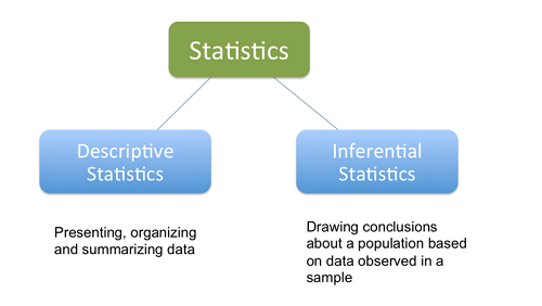
When it comes to the statistical tools that we use in practice, it can be helpful to divide the field of statistics into two large groups of methods: descriptive statistics for summarizing data, and inferential statistics for drawing conclusions from samples of data.
- Descriptive Statistics: Descriptive statistics refer to methods for summarizing raw observations into information that we can understand and share.
- Inferential Statistics: Inferential statistics is a fancy name for methods that aid in quantifying properties of the domain or population from a smaller set of obtained observations called a sample.
In this article, we’ll go deeper into Descriptive statistics.
Descriptive Statistics
Descriptive statistics refers to methods for summarizing and organizing the information in a data set. It’s of two types:
Uni-variate Descriptive Statistics
Different ways you can describe patterns found in uni-variate data include central tendency: mean, mode, and median and dispersion: range, variance, maximum, minimum, quartiles, and standard deviation.
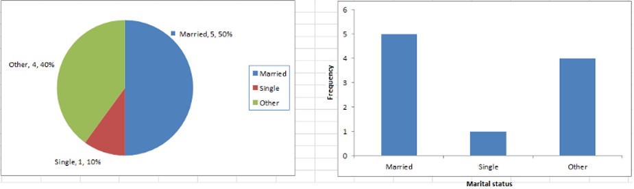
The various plots used to visualize uni-variate data typically are Bar Charts, Histograms, Pie Charts. etc.
Bi-variate Descriptive Statistics
The bi-variate analysis involves the analysis of two variables for the purpose of determining the empirical relationship between them. The various plots used to visualize bi-variate data typically are scatter-plot, box-plot.
We will use the below table to describe some of the statistical concepts.
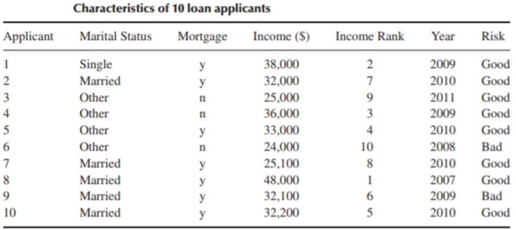
Elements: The entities for which information is collected are called the elements. In the above table, the elements are the 10 applicants. Elements are also called cases or subjects.
Variables: It is an attribute that describes a person, place, thing, or idea. It can take different values for different entities. e.g., marital status, mortgage, income, rank, year, and risk. Variables are also called attributes.
Variables can be either qualitative(categorical) or quantitative(numeric).
Qualitative: A qualitative variable enables the elements to be classified or categorized according to some characteristic. The qualitative variables are marital status, mortgage, rank and risk.
Quantitative: A quantitative variable takes numeric values and allows arithmetic to be meaningfully performed on it. The quantitative variables are income and year.
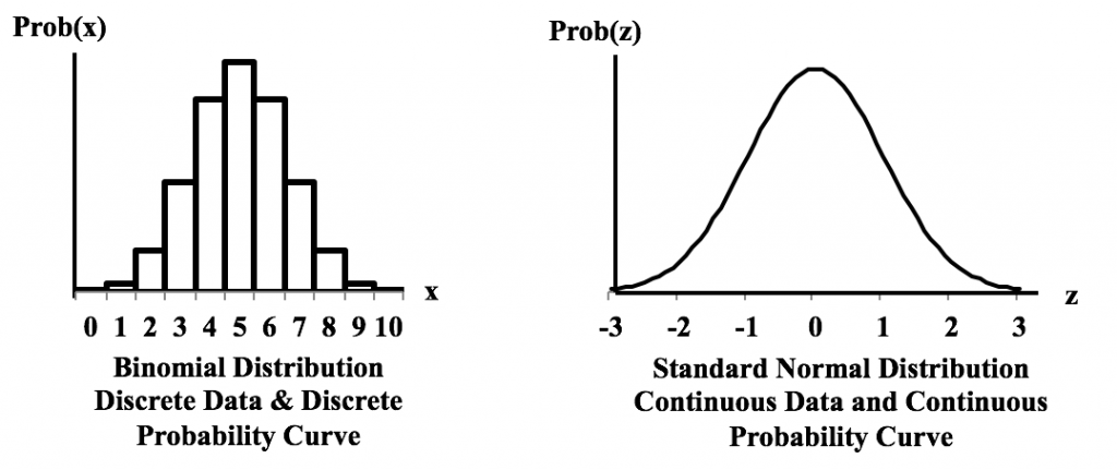
Discrete Variable: A numerical variable that can take either a finite or a countable number of values is a discrete variable, for which each value can be graphed as a separate point, with space between each point. ‘year’ is an example of a discrete variable.
Continuous Variable: A numerical variable that can take infinitely many values is a continuous variable, whose possible values form an interval on the number line, with no space between the points. ‘income’ is an example of a continuous variable.
Population: A population is the set of all elements of interest for some problem. A Parameter is a characteristic of a population.
Sample: A sample consists of a subset of the population. A characteristic of a sample is called a statistic.
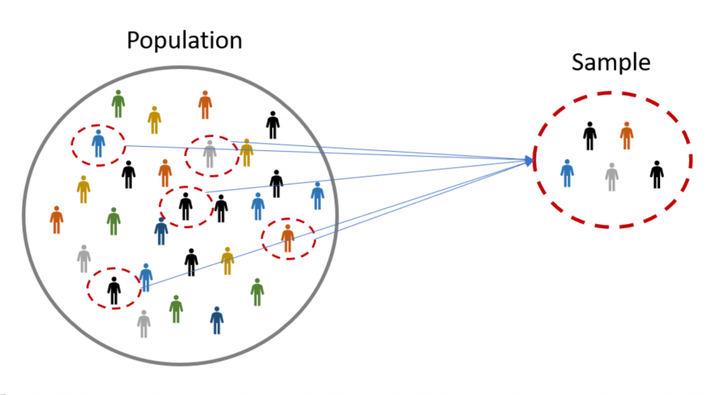
Random sample: When we take a sample for which each element has an equal chance of being chosen.
How to measure Central tendency?
To indicate where on the number line the central part of the data is determined using Mean, Median, Mode, Mid-range.
Mean
The mean is the average of a data set. , add up the values and divide by the number of values. The sample mean is the arithmetic average of a sample, and is denoted x̄ (“x-bar”).
The population mean is the average of a population, and is denoted as 𝜇, while the sample mean is the average of a sample.
Median
The median is the middle data value when there is an odd number of data values and the data have been sorted into ascending order. If there is an even number, the median is the mean of the two middle data values. When the income data are sorted into ascending order, the two middle values are $32,100 and $32,200, the mean of which is the median income, $32,150.
Mode
The mode is the most frequent value in a dataset. Both quantitative and categorical variables can have modes, but only quantitative variables can have means or medians. Each income value occurs only once, so there is no mode. The mode for the year is 2010, with a frequency of 4.
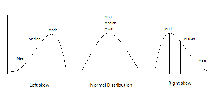
Comparison between mean, median, and mode on the graph.
Mid-range
The mid-range is the average of the maximum and minimum values in a data set. The mid-range income is:
mid-range(income) = (max(income) + min(income))/2 = (48000 + 24000)/2 = $36000
How to measures Variability?
The most common measures to describe the amount of variability or spread in the data are Range, Variance, Standard Deviation. It quantifies the amount of variation, spread, or dispersion present in the data.
Range
It is the difference between the maximum and minimum values in a set of values. The range of income is:
range(income) = max (income) − min (income) = 48,000 − 24,000 =$24000
Range only reflects the difference between the largest and smallest observation, but it fails to indicate how data is centralized.
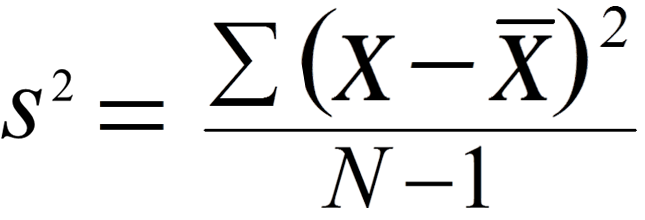
Variance
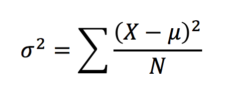
In Population, A variance is defined as the average of the squared deviation from the Mean, denoted as 𝜎² :
A larger Variance means the data are more spread out.
The sample variance s² is approximately the mean of the squared deviations, N replaced by n-1. This difference occurs because the sample mean is used as an approximation of the true population mean.
Standard Deviation
The standard deviation of a bunch of numbers tells you how much the individual numbers tend to differ from the mean.
The sample standard deviation is the square root of the sample variance √ s². For example, incomes deviate from their mean by $7201.
The population standard deviation is the square root of the population variance: sd= √ 𝜎².
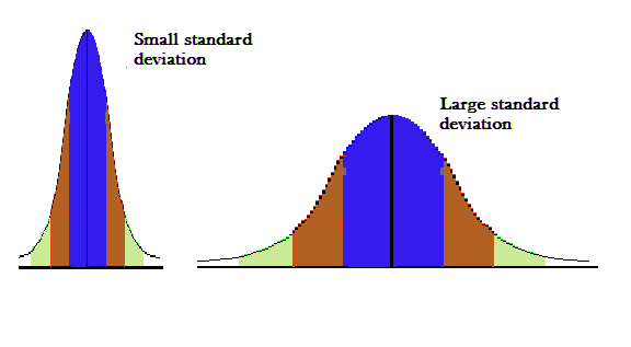
The smaller the standard deviation, the narrower the peak, the data points are closer to the mean. The further the data points are from the mean, the greater the standard deviation.
How to measures Position?
To understand where a certain value falls in a sample or distribution we use Deciles, Percentile, Interquartile Range (IQR), Standard score(Z-score), Outliers
It indicates the relative position of a particular data value in the data distribution.
Deciles
It splits the data into 10 equal parts and each part represents 1/10 of the data.
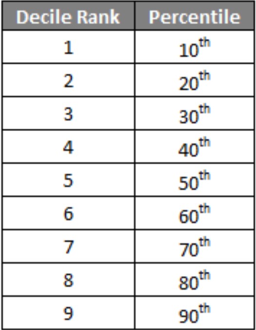
Percentile
The pth percentile of a data set is the data value such that p percent of the values in the data set are at or below this value. The 50th percentile is the median. For example, the median income is $32,150, and 50% of the data values lie at or below this value.
Interquartile Range (IQR)
The first quartile (Q1) is the 25th percentile of a data set; the second quartile (Q2) is the 50th percentile (median), and the third quartile (Q3) is the 75th percentile.
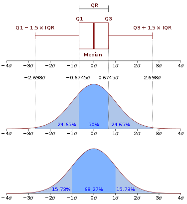
The IQR measures the difference between 75th and 25th observations using the formula: IQR = Q3 − Q1.
A data value x is an outlier if either x ≤ Q1 − 1.5(IQR), or x ≥ Q3 + 1.5(IQR).
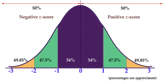
Standard score or Z-score
The Z-score for a particular data value represents how many standard deviations the data value lies above or below the mean.
The z-score is calculated as:
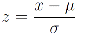
So, If z is positive, it means that the value is above the average. For Applicant 6, the Z-score is (24,000 − 32,540)/ 7201 ≈ −1.2, which means the income of Applicant 6 lies 1.2 standard deviations below the mean.
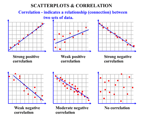
Scatter Plots
The simplest way to visualize the relationship between two quantitative variables, x, and y. For two continuous variables, a scatter-plot is a common graph. Each (x, y) point is graphed on a Cartesian plane, with the x-axis on the horizontal and the y axis on the vertical.
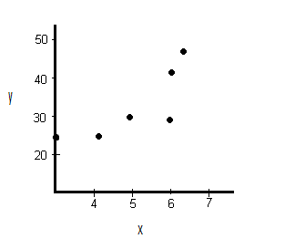
Scatter plots are sometimes called correlation plots because they show how two variables are correlated.
Correlation
A correlation is a statistic intended to quantify the strength of the relationship between two variables. The correlation coefficient quantifies the strength and direction of the linear relationship between two quantitative variables. The correlation coefficient is defined as:
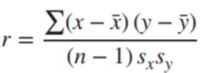
where sx and sy represent the standard deviation of the x-variable and the y-variable, respectively. −1 ≤ r ≤ 1.
If r is positive and significant, we say that x and y are positively correlated. An increase in x is associated with an increase in y.
If r is negative and significant, we say that x and y are negatively correlated. An increase in x is associated with a decrease in y.
Box Plots
A box plot is also called a box and whisker plot and it’s used to picture the distribution of values. When one variable is categorical and the other continuous, a box-plot is commonly used. When you use a box plot you divide the data values into four parts called quartiles. You start by finding the median or middle value. The median splits the data values into halves. Finding the median of each half splits the data values into four parts, the quartiles.
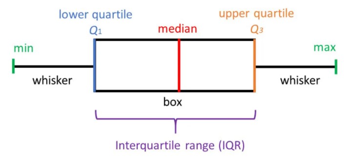
Each box on the plot shows the range of values from the median of the lower half of the values at the bottom of the box to the median of the upper half of the values at the top of the box. A line in the middle of the box occurs at the median of all the data values. The whiskers then point to the largest and smallest values in the data.
The five-number summary of a data set consists of the minimum, Q1, the median, Q3, and the maximum.
Box plots are especially useful for indicating whether a distribution is skewed and whether there are potential unusual observations (outliers) in the data set.
The left whisker extends down to the minimum value which is not an outlier. The right whisker extends up to the maximum value that is not an outlier. When the left whisker is longer than the right whisker, then the distribution is left-skewed and vice versa. When the whiskers are about equal in length, the distribution is symmetric.
Note: This article was originally published on theaidream, and kindly contributed to AI Planet (formerly DPhi) to spread the knowledge.